Notes
Above is the Animated Hero Carousel with controls toggled on, slide indicator dots toggled off, and using the center aligned layout.
Below is the Animated Hero Carousel with controls toggled on, slide indicator dots toggled off, and using the left aligned layout.
To see the Animated Hero video layout see this page. No animations are used, but the following notes about the text fields and links also apply here. Note that the play/pause button can be hidden in this layout. This layout has to be shown on a separate page because the video autoplay does not work when used on the same page with another hero component.
Functionality/customizability notes (these apply to all Animated Hero Carousels):
- the animation can be toggled on or off for each slide individually, and separately for mobile and desktop
- the zoom function (in or out), scale, speed, location, and delay can all be adjusted individually on each slide, and separately for mobile and desktop
- each text field (eyebrow, title, copy) is optional for each slide
- including a link is optional for each slide
- this component doesn't have to be a carousel, it can also be used with just 1 slide
- the center aligned and left aligned layouts are applied to all slides in the component, and cannot be changed for individual slides
- the slides use a 21:8 aspect ratio on desktop and a 9:16 aspect ratio on mobile
Notes
Above is the Standard Hero Carousel using the bottom text layout.
Below is the Standard Hero Carousel using the center text layout.
Functionality/customizability notes:
- the slides use an approximately 23:10 aspect ratio on desktop and 1:1 on mobile
- each text field (title, subtitle, copy) is optional for each slide
- including a link is optional for each slide
- this component doesn't have to be a carousel, it can also be used with just 1 slide
- the bottom text and center text layouts are applied to all slides in the component, and cannot be changed for individual slides
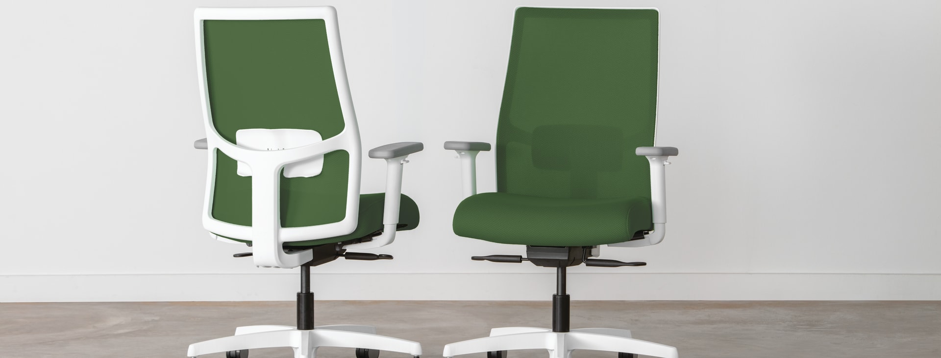
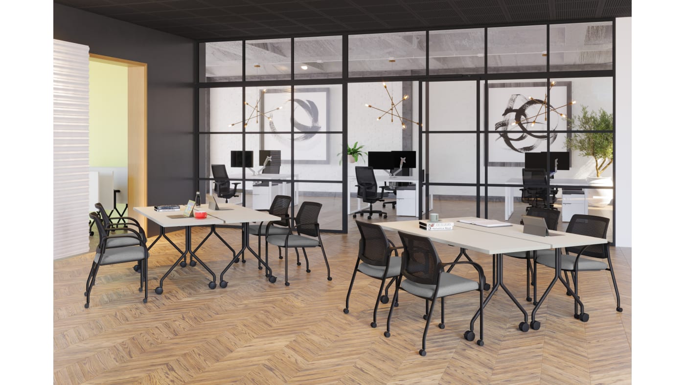
Ignition
Work has changed. Ignition has responded.
There are plenty of reasons to love the all-in-one solution of an Ignition chair, but its customization capabilities are at the top of the list. The collection lets you mix and match adjustment features, various back heights, and sleek design options—including a choice of mesh back styles for enhanced breathability and support.
Notes
The 2 components above are the Spiffy Hero. The first is the standard layout to be used in new series pages, and the second is just without the resource links.
Below is the Standard Hero Carousel using the bottom left text layout. This is the hero layout used on current series pages.
For notes on the component below (Standard Hero Carousel using the bottom left text layout), see the notes section above for the other Standard Hero Carousel layouts.
Functionality/customizability notes (for the Spiffy Hero):
- the images use a 16:9 aspect ratio
- each text field (title, subtitle, copy) is optional, and can be styled separately
- including link(s) is optional, and can be a standard CTA button instead of the rows layout used on series pages
- when not using the rows layout for links, the text can be vertically aligned with the top of the images or center aligned
- this component should be used with at least 3 images
Notes
The component above is the Standard Reduced Height Hero layout.
The component below is the Reduced Height With Optional Text Below Hero layout.
These components follow the same functionality/customizability notes as the other standard hero components, with some additional notes:
- the height of the component can be adjusted
- when using the style above, the text box alignment can also be centered in the image
- when using the style below, the text section is very flexible, the text styling can be changed, it can be left or center aligned, the text fields and CTA are all optional, an eyebrow or subtitle could be added, the CTA button styling can be changed, the text section as a whole can also be excluded, just leaving the banner image
Lorem Ipsum
Sed maximus orci at cursus gravida. Etiam interdum leo vel urna cursus, eget blandit nisi blandit. Sed vehicula, neque vel auctor accumsan, nunc tellus tempor felis, eget condimentum nunc libero a tortor. In hac habitasse platea dictumst.
Notes
The component above is the Highlights Hero, currently used for HON Highlights articles.
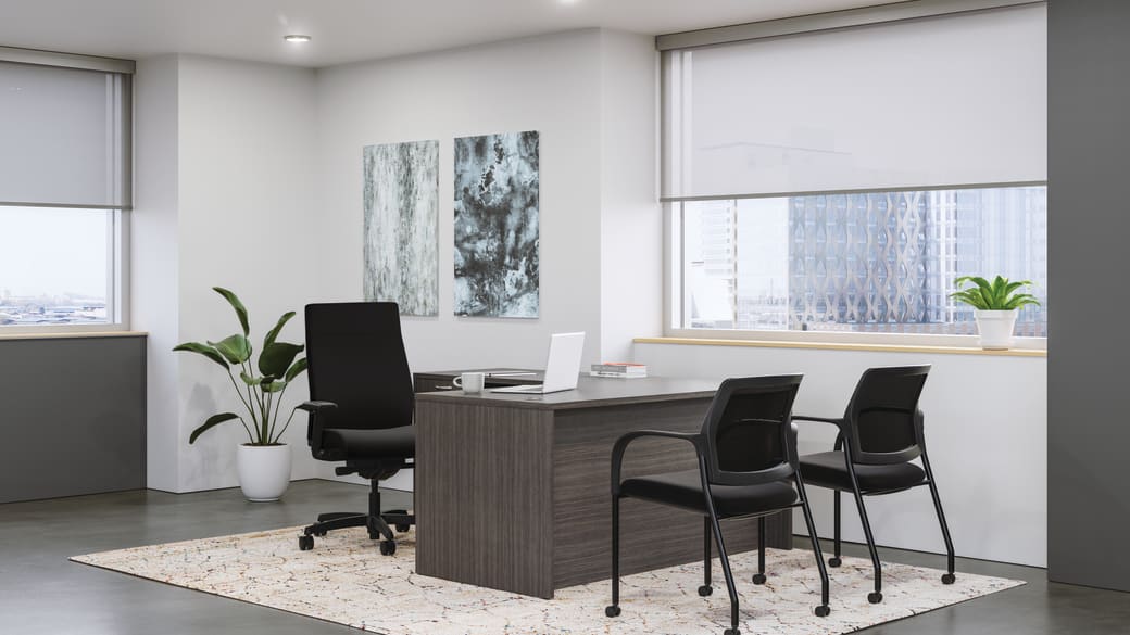
The component below is the Copy Left, Image Right Hero, currently used for the Industry pages.
Functionality/customizability notes for the Highlights Hero:
- the image uses an approximately 2:1 aspect ratio on desktop and 1:1 on mobile
- only one text field is available (the title field as shown above)
- this layout cannot be a carousel
- the width can be adjusted
- cannot include a link
Functionality/customizability notes for the Copy Left, Image Right Hero:
- the image uses a 4:3 aspect ratio on desktop, and slightly wider than 1:1 on mobile
- each text field is optional
- the background color can be modified, and doesn't have to be included (i.e. white background)
- the widths of the text and image sections cannot be adjusted
- the text section and image cannot switch sides, the text will always be left, and image always right
Eyebrow
Title
Lorem ipsum dolor sit amet, consectetur adipiscing elit. Duis lacinia justo vitae ex semper luctus.