WIDTH: RESIZE ME
About
This page was made to demonstrate how the PHAT row and column stylings work on hon.com. 🤯
Column Widths
The columns are divided in widths of 12, aka a row takes up the width of 12 columns. If you go over 12 columns, then the column will default to the next row. This 12-column layout/grid is a standard used by libraries like Bootstrap.
Ex. A row with columns 6-6 would give a row 2 columns that take up half the row, 6/12 = 50%.
Ex. A row with columns 4-4-4 would give a row 3 columns that take up a third of the row, 4/12 = 33%
The widths are just using fractions that go up to 12! 😀
Breakpoints
To understand how the columns work, we first need to understand the breakpoints. 🤔
I like to think of the site having 3 different layouts.
We have SMALL which is any browser width less than 768px.
» This formatting would be designed for devices like cell phones. 📱
We have MEDIUM which is any browser width more than ore equal to 768px and less than 1024px.
» This formatting would be designed for devices like tablets or chromebooks.
We have LARGE which is any browser width more than 1024px.
» This formatting would be designed for devices like laptops and monitors. 💻
On hon.com, the width of the columns takes up the space specified on large. However, on medium and small, each column uses the full width.
Small screen sizes may change the layout on certain components (ex. Hero Carousel), but keeps the full width like medium screen sizes.
Contents
Offset Rows That Add to 12
Combined Widths Larger Than Row Size
Symmetrical Rows
Hero Example
Contrast Copy With Image Gallery Example
Offset Rows That Add to 12
11 - 1
10 - 2
9 - 3
8 - 4
7 - 5
6 - 6
5 - 7
4 - 8
3 - 9
2 - 10
1 - 11
3 - 3 - 6
6 - 3 - 3
Combined Widths Larger Than Row Size
3 - 3 - 3 - 3 - 3 - 3
2 - 6 - 6
6 - 2 - 6
Symmetrical Rows
1 - 1 - 1 - 1 - 1 - 1 - 1 - 1 - 1 - 1 - 1 - 1
2 - 2 - 2 - 2 - 2 - 2
3 - 3 - 3 - 3
4 - 4 - 4
3 - 6 - 3
2 - 8 - 2
1 - 10 - 1
12
Hero Example
12
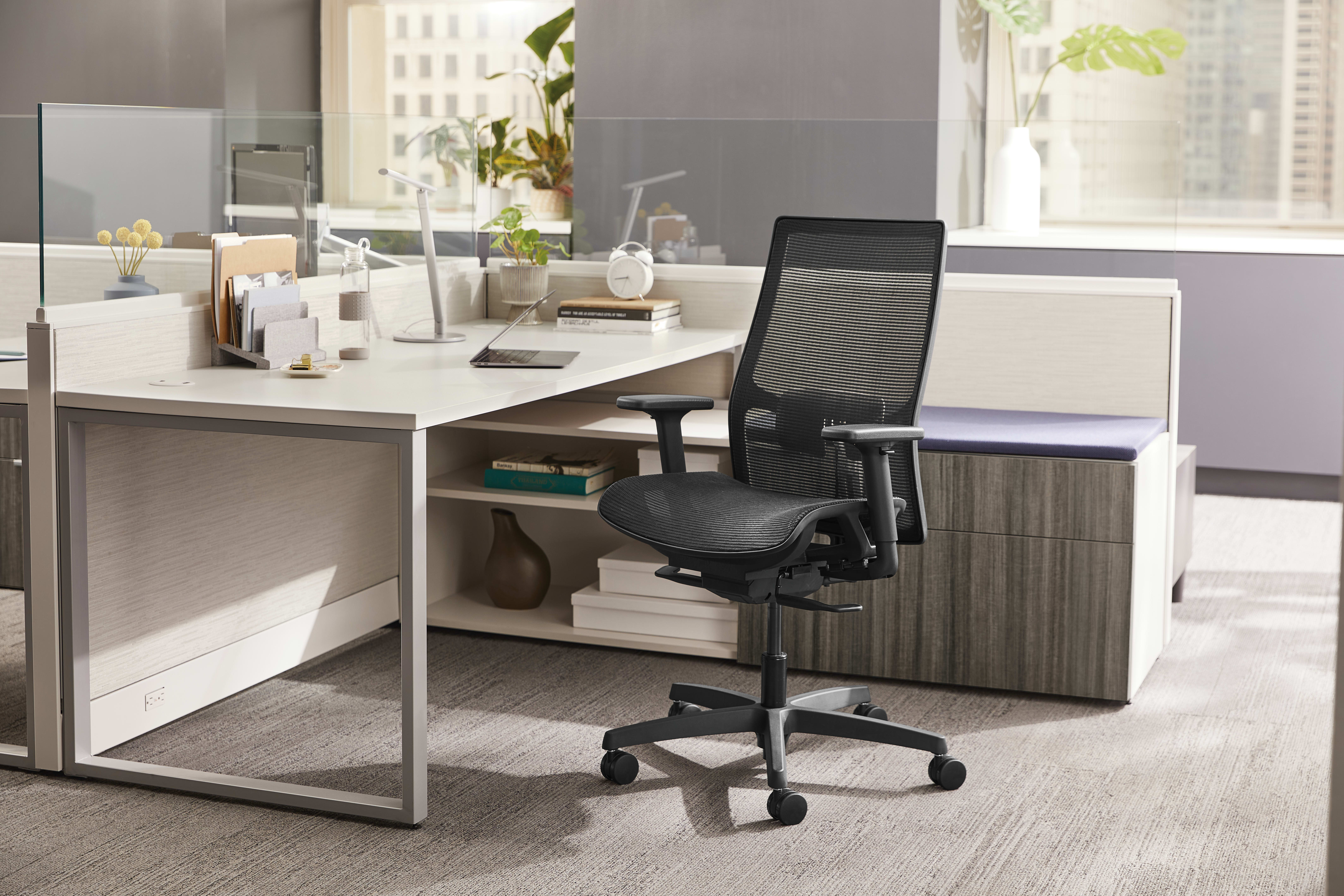
Take note how the image always stays full width, even at ultrawide resolutions. Also notice how the mobile view changes at medium and small breakpoints. Observe how the mobile image focuses on what it thinks is most interesting.
1 - 10 - 1
2 - 8 - 2
Notice how the layout changes depending on screen width instead of column width.
3 - 6 - 3
2 - 8 - 2
This is the hero carousel with the bottom left layout. Notice how the different screen sizes change the copy placement.
Contrast Copy With Image Gallery Example
12
Notice how the image has a max width of 800px even at ultrawide resolutions.
Work has changed. Ignition has responded.
1 - 10 - 1
Work has changed. Ignition has responded.
2 - 8 - 2
View the overlap of the image and copy when placed in this column width.
Work has changed. Ignition has responded.
3 - 6 - 3
Since the breakpoints change based on the size of the screen and not column, this overlaps stays until we change to the medium or small breakpoints.


